Although I’ve done most of the graphics for In Retrospect myself, I hired a graphic designer friend of mine to do the logos for the game and my company, Paper Salamander. And he came up with some awesome stuff. But we’ll get to that later. During the process of communicating what I was looking for to him I collected a fair amount of video game logos that I like, so I figured I’d make a post about it.
Let’s start retro. One of my all-time favorite logos is the Yoshi’s Island logo, because it totally nails the fun, youthful tone of the game (you play as Yoshi and baby Mario.) Simple, colorful, and a super neat font.

I also always had a thing for the “perspective” style logos that appeared a lot in the 8-bit and especially 16-bit eras.

They often did some neat things with the coloring / gradients in that era as well.

Of course a lot of new indie games are heavily inspired by the past, and sometimes a nice simple retro logo does wonders for a game.
![]()
Another thing I like in my logos is a sense of simplicity and beauty. Of course, this depends on the game and whether that fits or not, but when it works, it really stands out for me. I especially like the colors on this one, and you’ll see below that they also show up on the logo for Paper Salamander.

And then you have something like Gone Home, which keeps it VERY simple in the text itself, a single color scratchy font, but it works in the context it is used.

Thomas Was Alone also keeps it simple, but add in the shapes and it really represents the game well.

Indie games in general have a lot of my favorite logos. They really seem to try to say something about the game through the logo. Celeste is about a lot of things, but on the surface it is about climbing a mountain, so they put the mountain right in the logo.
![]()
I mostly like this BIT.TRIP logo because of the colors, but it’s a pretty cool retro logo with a neat font as well.
![]()
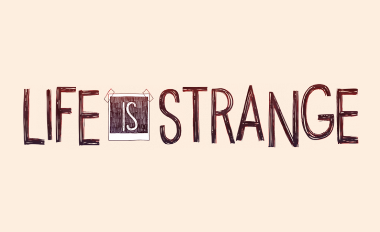
Life Is Strange works the photography in as well. And has a custom scratchy font that works.
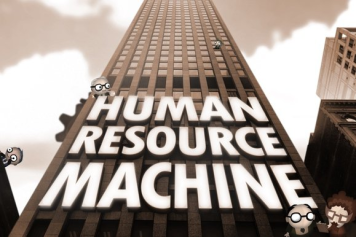
It almost feels unfair to include Tomorrow Corporation logos because their art is so amazing it feels a step above most indies.
![]()
And another Tomorrow Corporation game logo that works very well in context.
One of my favorite indie game logos is for Night in the Woods, it has a lot of energy and style.

And finally, some busy logos that actually work as busy logos. The World Ends With You to start.

Just love everything about this Earthworm Jim logo. It has a LOT going on, but it all looks good together.
![]()
Pikmin 3 uses the Pikmin themselves to create a logo, it’s so adorable!!!
![]()
Viewtiful Joe, a wild game with a wild logo.
![]()
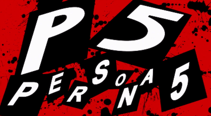
I don’t know if this is an official logo but I can’t do anything about style without including the king of style, the Persona games.
I’m sure I’m missing a bunch of great ones, but this will have to do for now.
Anyway, here are the logos for Paper Salamander and In Retrospect! I think they both turned out great!

![]()