I’ve been super engrossed in making sprite backgrounds for In Retrospect lately, in fact it’s pretty much all that I have been doing on the game for the last couple of months. It’s very overwhelming, and if I learned anything from this experience it is that I want to plan my next game right so that I don’t have so many darn backgrounds to make all at once. But I digress. Today I want to talk a bit about the process of making a background. I’m not an artist by trade, in fact this game is the first time I have put much time into anything art related, so I won’t be able to explain the art process much beyond some basic stuff I’ve stumbled upon. I can really only just show you my trial and error process and how it resulted in a background that I’m pretty happy with.
I’m going to use my stage one background for this post, not because it is necessarily my best background, but because it is the one that went through the most revisions, and I made some of the most mistakes with it, so it’s probably the best one to see evolve over time. It’s currently on its 20th iteration, which I hope will be the last one, though I will probably still tweak a few minor things here and there moving forward. I won’t show all 20 iterations though, you will see some iterations skipped below and it is because they had insignificant changes (often just tweaking the edge of a cloud or something), so I’ll stick with only showing off the ones where a significant change was made.
Let’s begin.
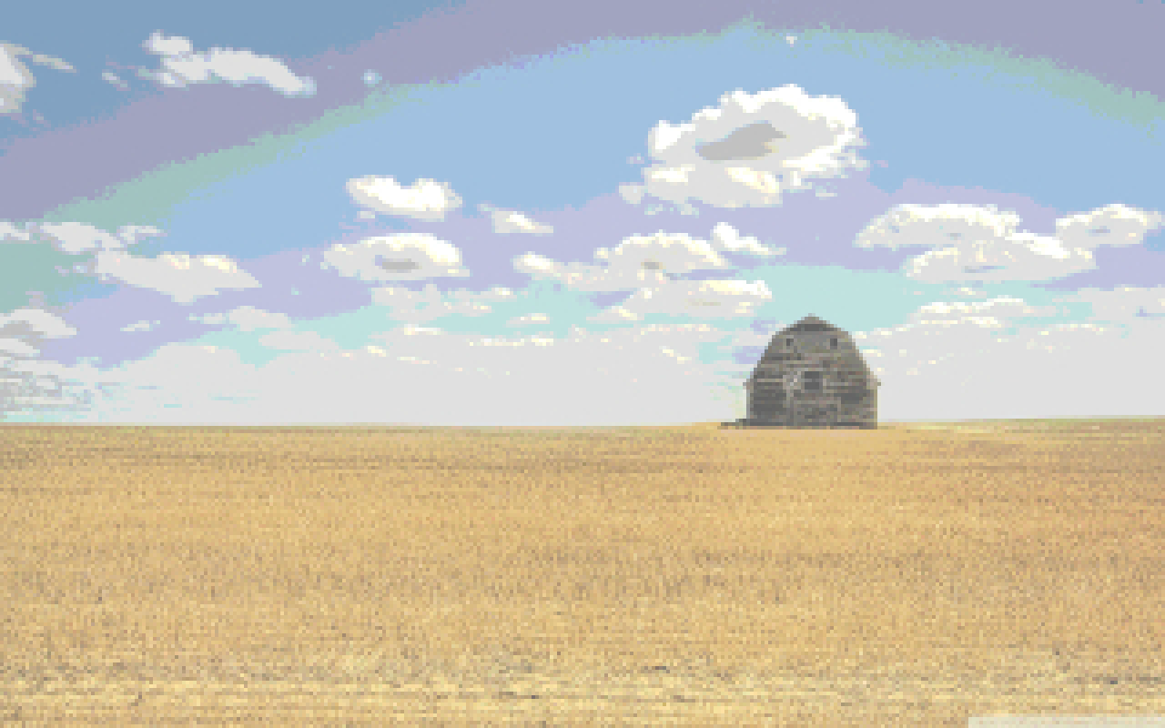
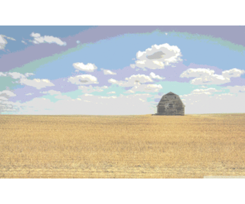
First off, for almost every background in In Retrospect I start with a reference photo (usually just something found in free stock photos online or whatever) which I mess around with a bit in GIMP to pixelate it a bit so it fits the game more. I tend to try out a bunch of backgrounds until I find one that fits what I want. I then mess around with the size a bit to make it (more or less) fit the perspective of my game, although honestly, I don’t have the best sense of correct perspective so it becomes a “feels right” type of thing more than a science. The theme for stage one is childhood excitement and exuberance, and I knew I wanted to set it on a farm because, basically, running around on one of my relative’s farms is one of my childhood memories that best fits the feel I wanted for this stage.
REFERENCE IMAGE
I do all of my sprite work in Pyxel, and to get to my first iteration of a background I tend to more or less trace over my reference photo, but with a much smaller color palette and simplified objects (especially when it comes to complicated things like field textures.) I’m mostly just trying to get the feel right at this point, but with my own art, as opposed to the placeholder background.
ITERATION #1
As you can see I originally made the farm a bit run-down, with dying trees. However, that didn’t really feel right to me, since I was going for “excitement” and “exuberance”. I also just kind of hastily sketched out the ground, but it felt too sloppy.
ITERATION #2
So I made nicer trees and cleaned up the ground. The colors had felt dull, so I brightened them up a bit too.
But the ground was still bothering me, it felt like a big chunk of boringness. I tried out a bunch of stuff that wasn’t working at all, got frustrated, and put this background on hold for a bit. However, when working on some other backgrounds I started looking to one of my favorite SNES era art inspirations, Yoshi’s Island, for some ideas. And I noticed they often used a kind of soft gradient in their skies.
YOSHI’S ISLAND
I started doing a similar thing with the sky in some of my other backgrounds and it was looking pretty solid, so I decided to try it on the ground in stage one’s background.
ITERATION #3

It had a decent effect. You’ll notice also that the image is taller now. My process is to originally make all of my backgrounds 480×270 pixels, which can be multiplied by 4 to make a 1920×1080 background. I then have a background that nicely covers the screen on a typical 1920×1080 monitor or TV (and my graphics stretch to fit other resolutions.) HOWEVER, since I use parallax scrolling my backgrounds move a bit when the player moves. I make sure that a background like this tiles nicely left to right, but it’s kind of hard to make it tile nicely top to bottom when you have sky and ground, so without adding some padding on the top and bottom, you end up with a situation where if you get too high up in the level you see the bottom of the ground show up on top of the sky, and vice versa. So after I get a background into a decent state I add some padding on the top and bottom to make sure that never happens.
Anyway I felt like it was getting there but the colors still felt too dull, so in my next iteration I brightened them up a bit again.
ITERATION #4
At this point I was kind of happy with the state of the background, but even with the gradient, it still felt like there was too much empty space on the bottom. Sure, you mostly never see the entire bottom, but on occasion you see quite a bit of it, and it felt wrong to me. I tried to add a variety of farmlike things down there like haystacks and such, but none of that was working.
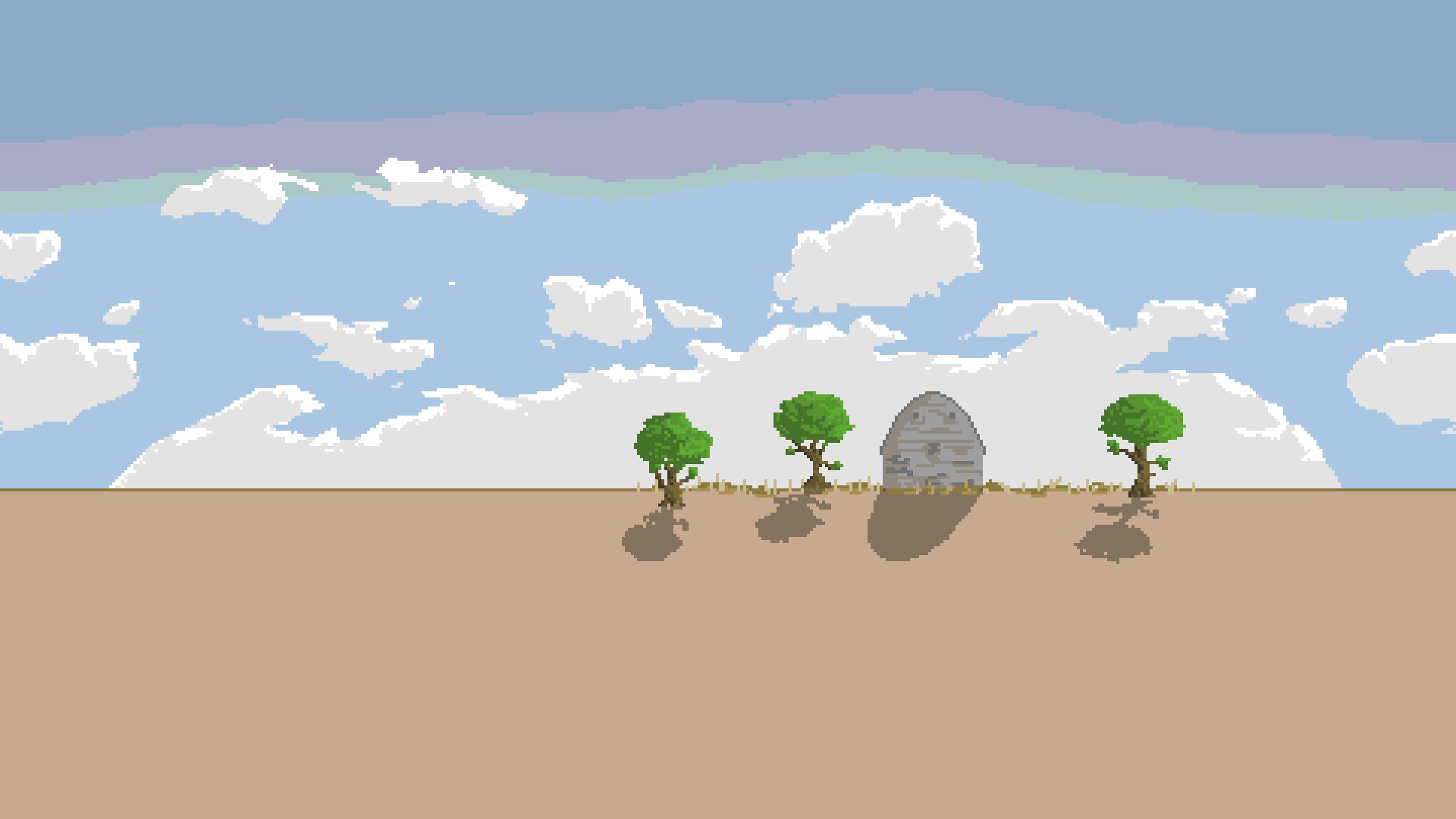
ITERATION #5
So I made a lake.
I also redid the gradient to have more steps and so instead of smooth change from one color to another the lines jump around a bit, which I thought better hinted at (without explicitly being) the sort of rows of uh… stuff? you might find on a farm. I had no clear idea WHAT that stuff might be and why it would be covering the entire field, which is why I left it as just a hint.
But the lake felt all wrong to me.
Doubly so when you got further to the right in this level and, due to the tiling, the lake started appearing again. I only wanted one lake, not multiple, identical lakes! (This is always an issue when putting a “unique” object into a background that is supposed to tile, but, for instance, it doesn’t matter with the trees and the farmhouse in this case because the level isn’t long enough for them to start showing up again.)
I kind of liked the idea of a lake, but I wanted something that tiled nicer.
ITERATION #6
So I turned it into a river. It’s hard to explain to people who haven’t had experience with this kind of art, but although the lake might look ok in a single image, even better in some ways, the river felt better as a tiled background, because it hides the tiling better so things feel smoother as you move to the right. One thing I’m learning fast is that game art is all about context, backgrounds especially. You can’t just make something that looks fine as a standalone image and call it a day. I also saturated the colors more again, because it still looked too desaturated, especially next to my other backgrounds.
But the area below the river still looked too empty to me.
ITERATION #7
So I added a bunch more trees! Cool, ri… right? Keep in mind I am an amateur here, and this was a process of experimentation.
Whatever the case, it certainly made the area below the river less empty, but I knew something was off, because now the background just felt way too busy.
ITERATION #10

So I pulled down the shadows a bit. That helped some, but look at this monstrosity. It’s still way too busy!
ITERATION #11

To deal with the busyness I looked at the sky, and realized I had stuck with this multi-color sky for no real reason other than the fact that my original source image had it. So I decided to clean up the sky and use a soft gradient on it. That definitely helped a bunch, but it was still too busy.
Well gee, I wonder how to fix this one.
ITERATION #13
Get rid of all of those trees I added, duh! Sometimes you have to admit you made a mistake and fix it.
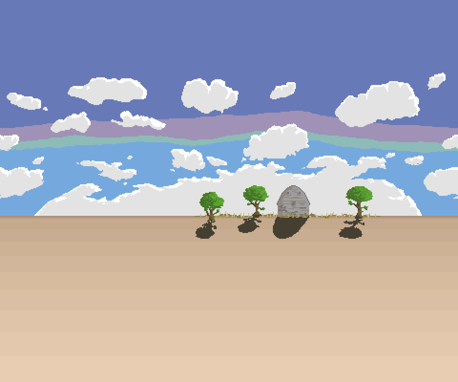
Honestly, at this point I was pretty happy with where things were at in context of stage one alone. The image above looks pretty solid, right? However, one of my big concerns with In Retrospect is that I feel like stage one and two are too similar, and now they both had similar colored blue skies as well. So I decided to do something about that.
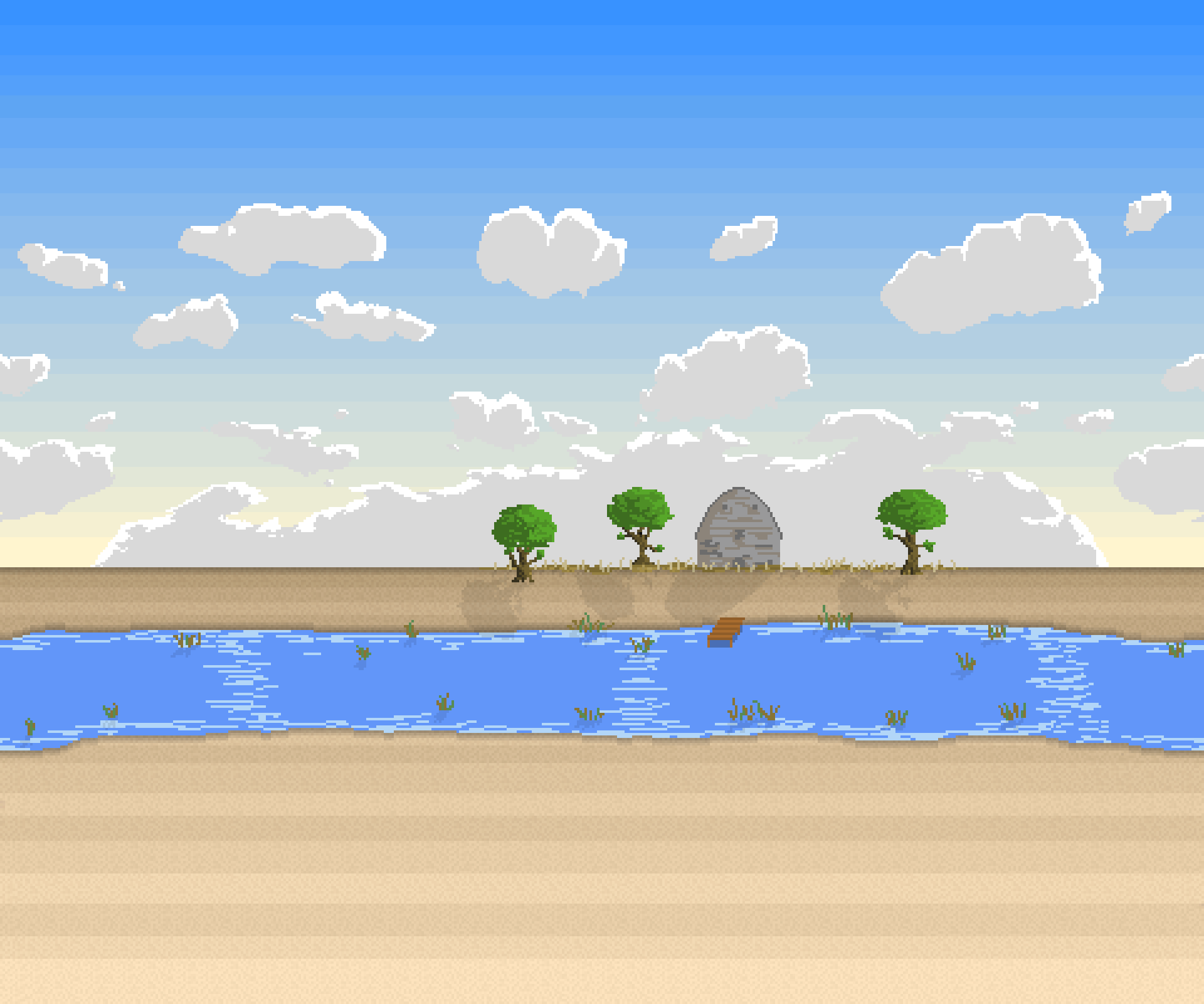
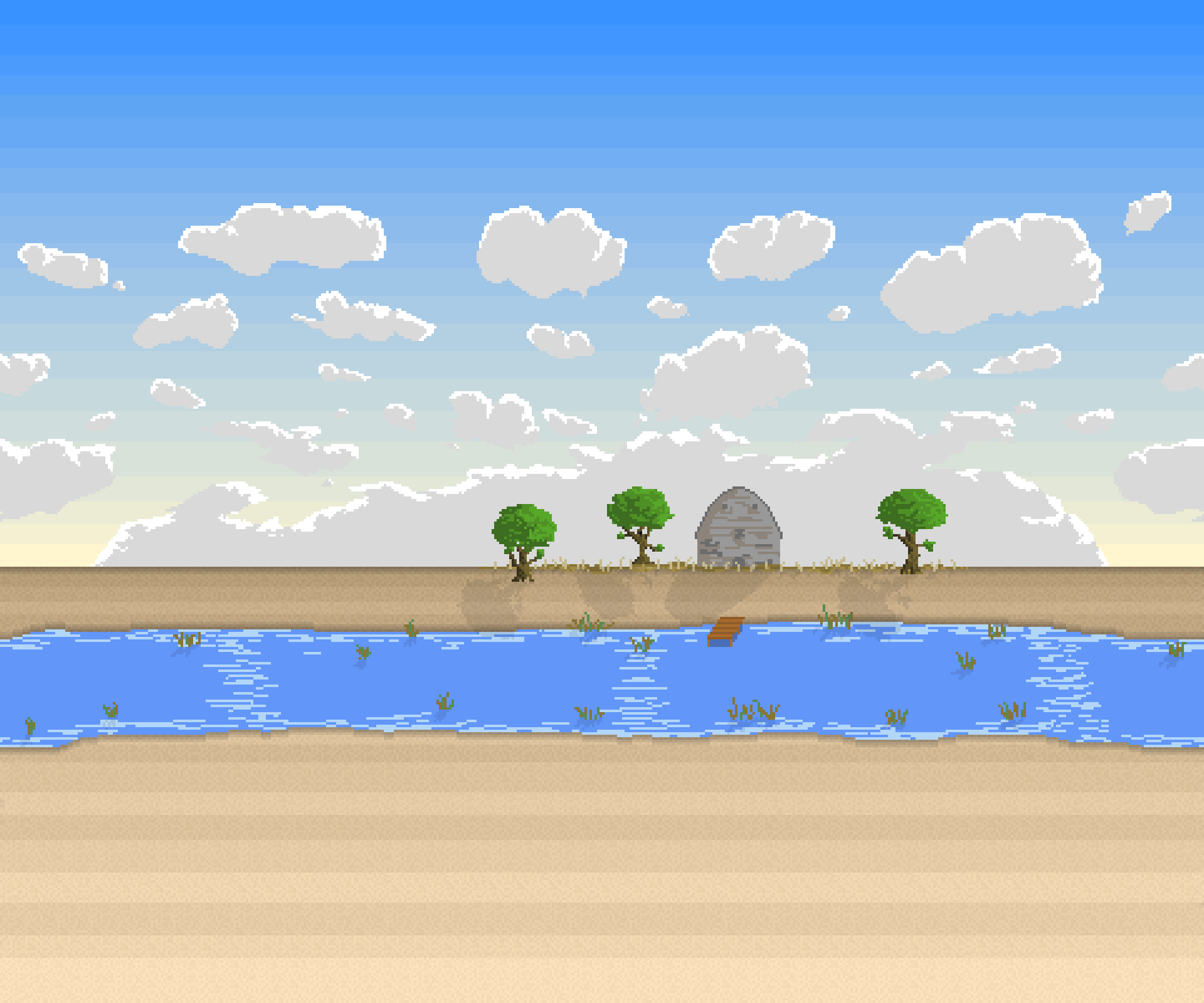
ITERATION #15

I decided to change the sky gradient. I honestly expected to have to try a bunch of different colors out, but the first yellow I picked I ended up liking, so I stuck with it.
The yellow made the clouds and sky blur into each other a bit at the bottom though, so I gave the clouds more contrast with the yellow by darkening the gray in them a bit, which ended up looking way cooler anyway, so that worked out nice.
I also made a texture behind the ground using four colors, and added some transparency to the ground so the texture comes through a bit. Just gives it a little more of a “ground” feel, and distinguishes it from the sky a bit.
However, with a more dramatic color shift in the overall sky gradient, each little step becomes a lot more noticeable. I’m obviously making “pixel” style games so I don’t try to hide every “line”, but I like to find a balance and the sky lines felt too obvious now.
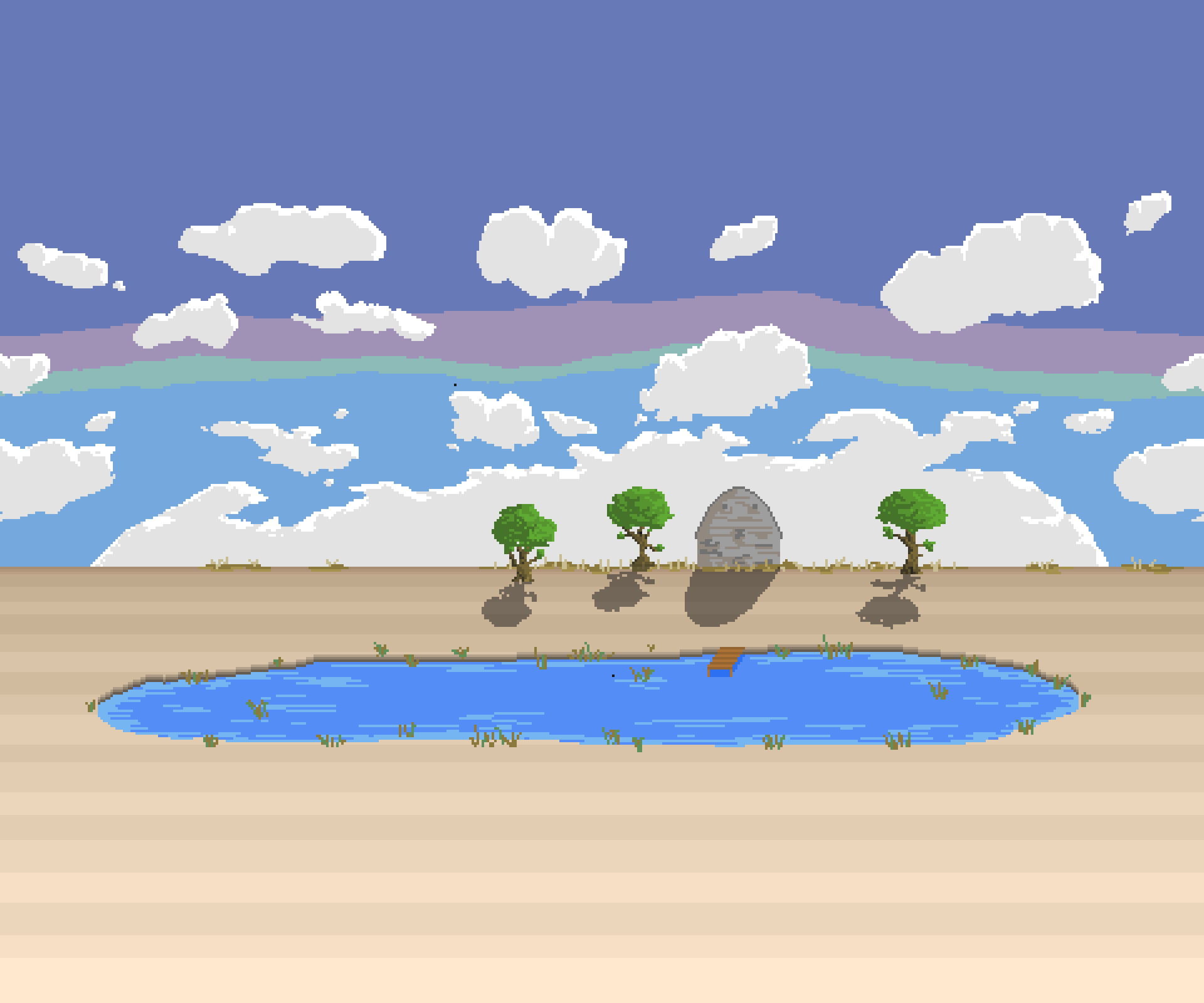
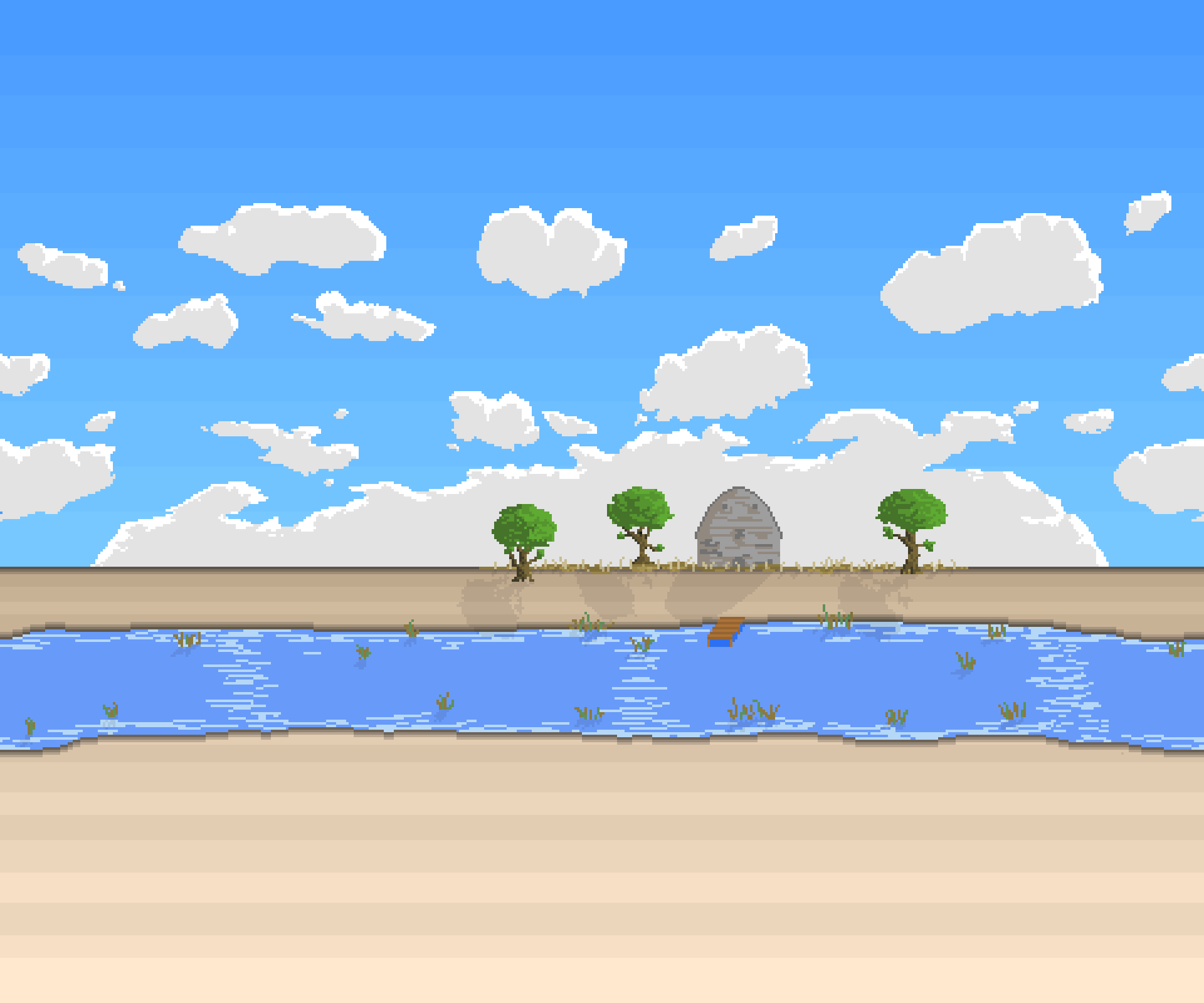
ITERATION #16
So I changed the gradient to give it more steps, making the color changes a bit less obvious. I was pretty close to calling this one done but I decided to try one last thing.
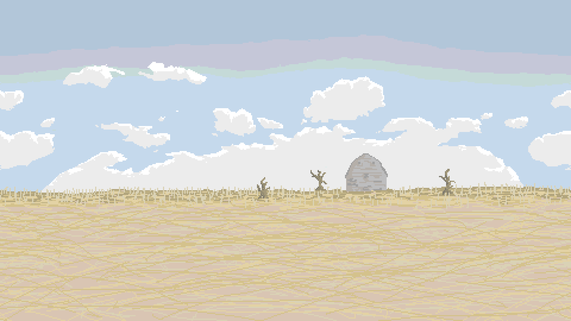
ITERATION #20
I added more clouds. Uh oh, is this really a step forward?! Honestly, it’s tough for me to say, and I go back and forth on whether this iteration is better than the last one, or if I just made it too busy again.
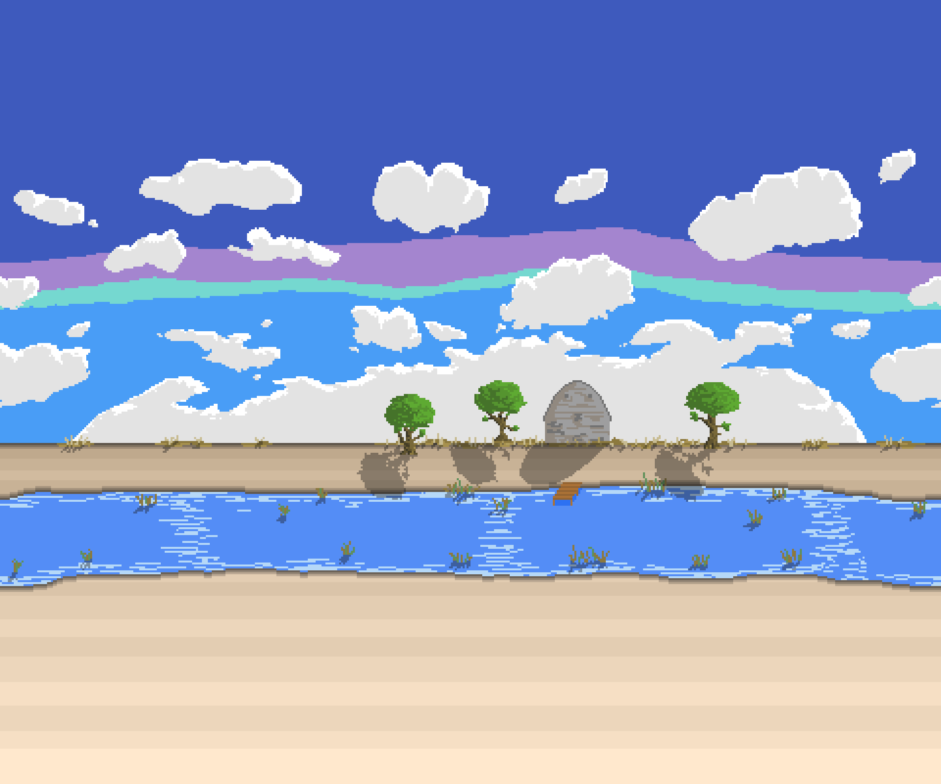
But for now, I’m pretty happy with it, and I decided to call this “done” and move on. There are still a TON of experiments I could try on this background, or little tweaks I could do, and I’ll probably see a few things here and there that nag at me and get me to change them, but as a solo indie developer who is doing a lot of art, audio, storytelling, game design, programming, etc. in addition to my full-time job and other responsibilities, I’m trying to get ok with things not being perfect. I’ve already been working on this game for over 4 years, I don’t really need to make it a 10 year project.
ENTIRE PROCESS
Anyway if you have any questions, comments, concerns, etc. I’d love to hear them!